![EPAM_FORD_CaseStudies_KL](https://bohlmanndesign.com/wp-content/uploads/2019/10/Jamba_01-1.jpg)
![EPAM_FORD_CaseStudies_KL](https://marisabohlmann.com/wp-content/uploads/2019/10/Jamba_01-1.jpg)
CLIENT:
Jamba Juice
ROLE:
UX/UI Designer
TEAM:
Continuum—Chip O'Toole, Chris Brown
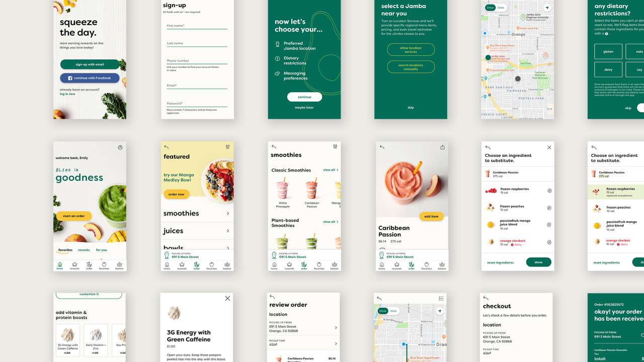
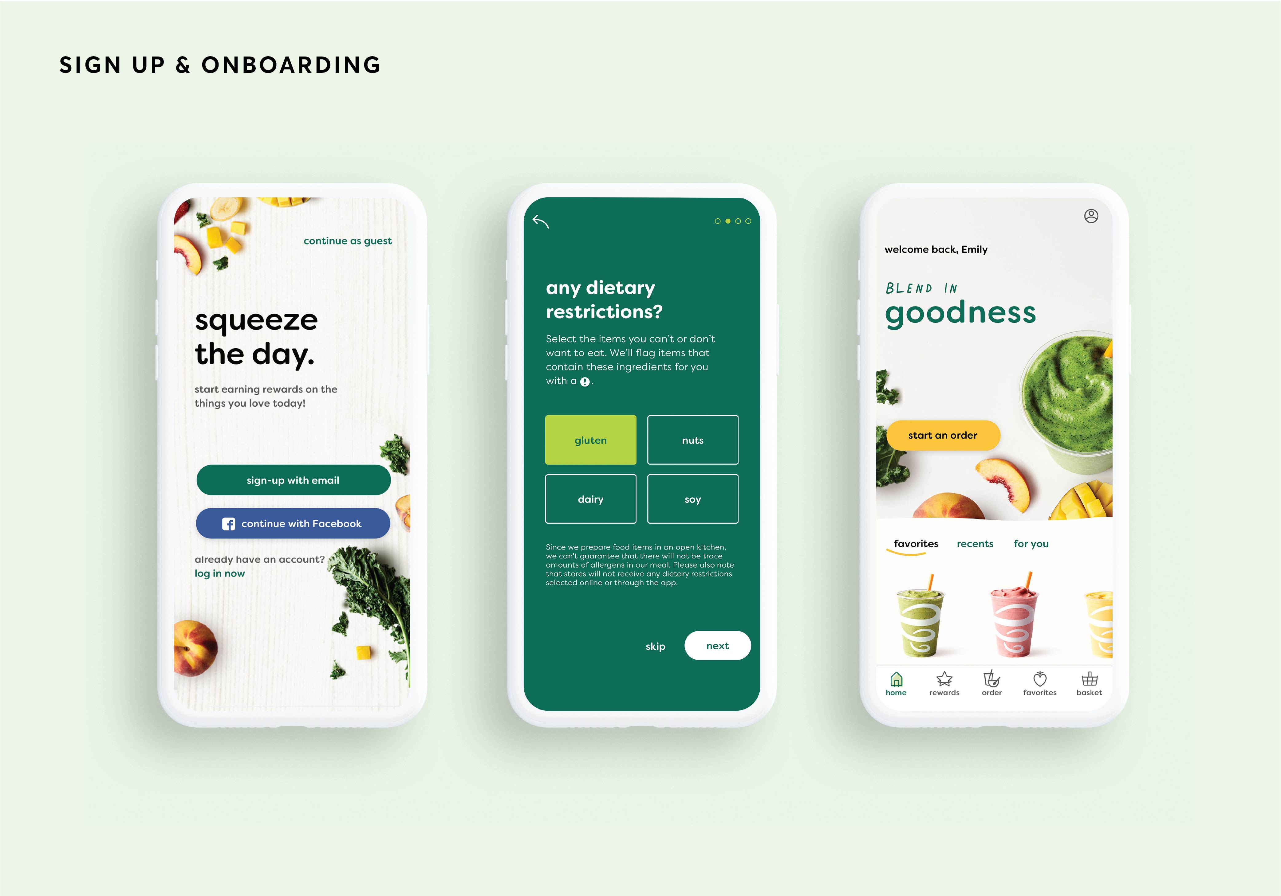
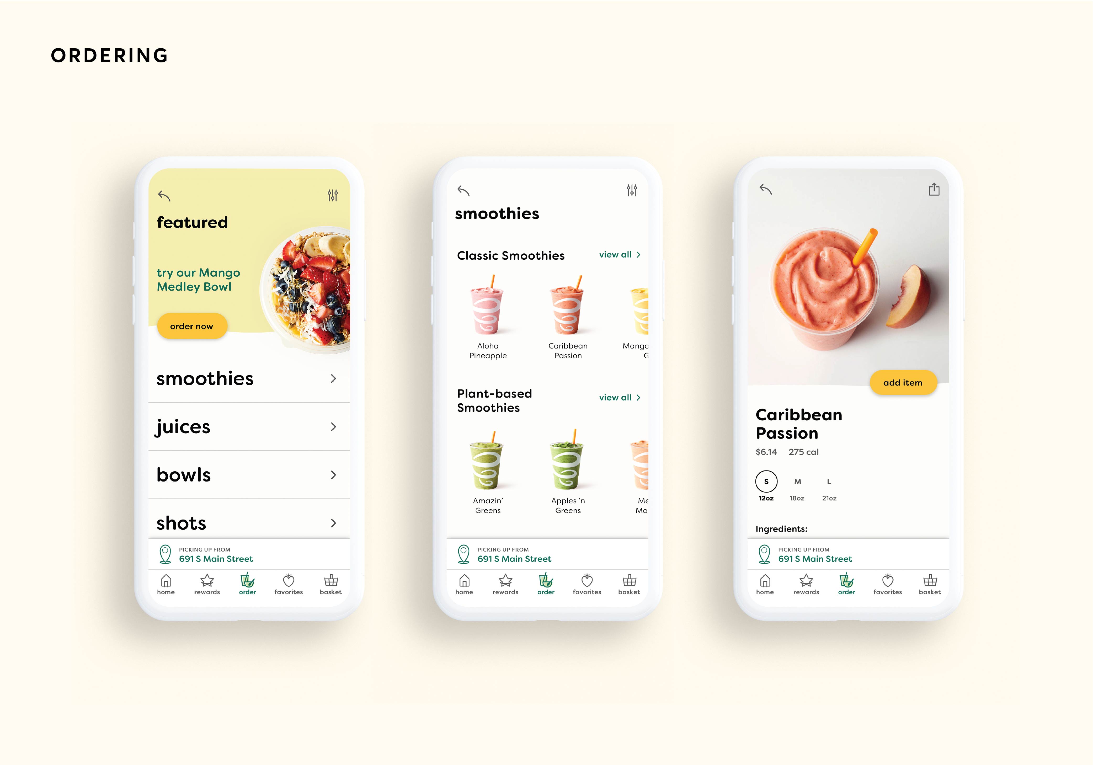
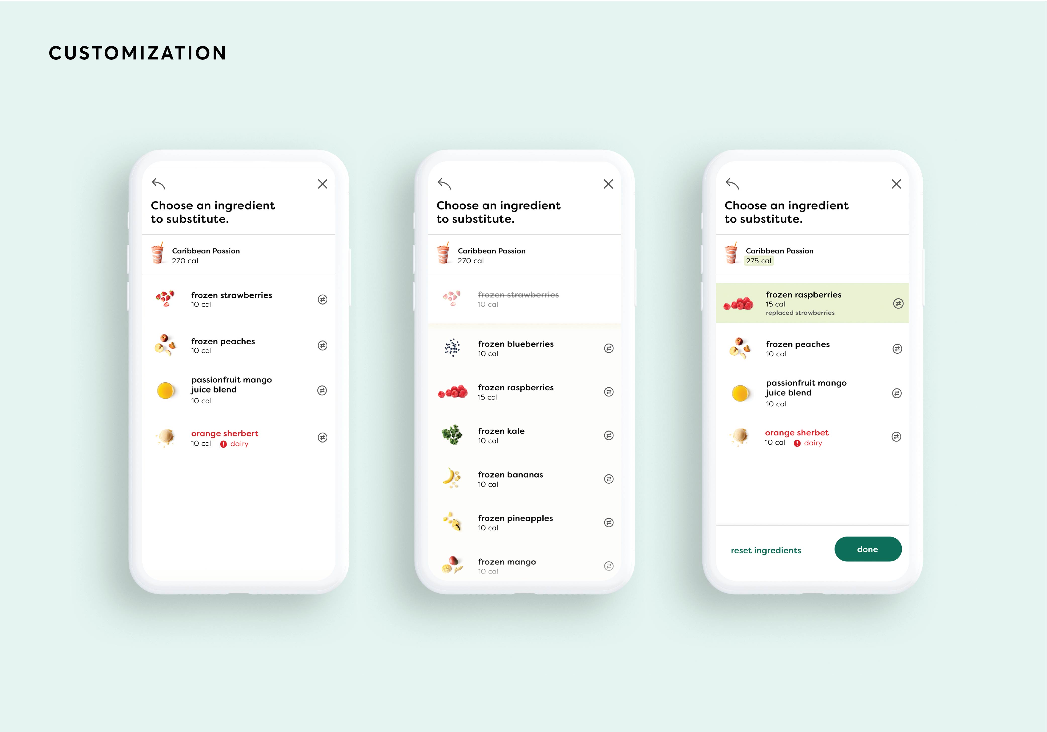
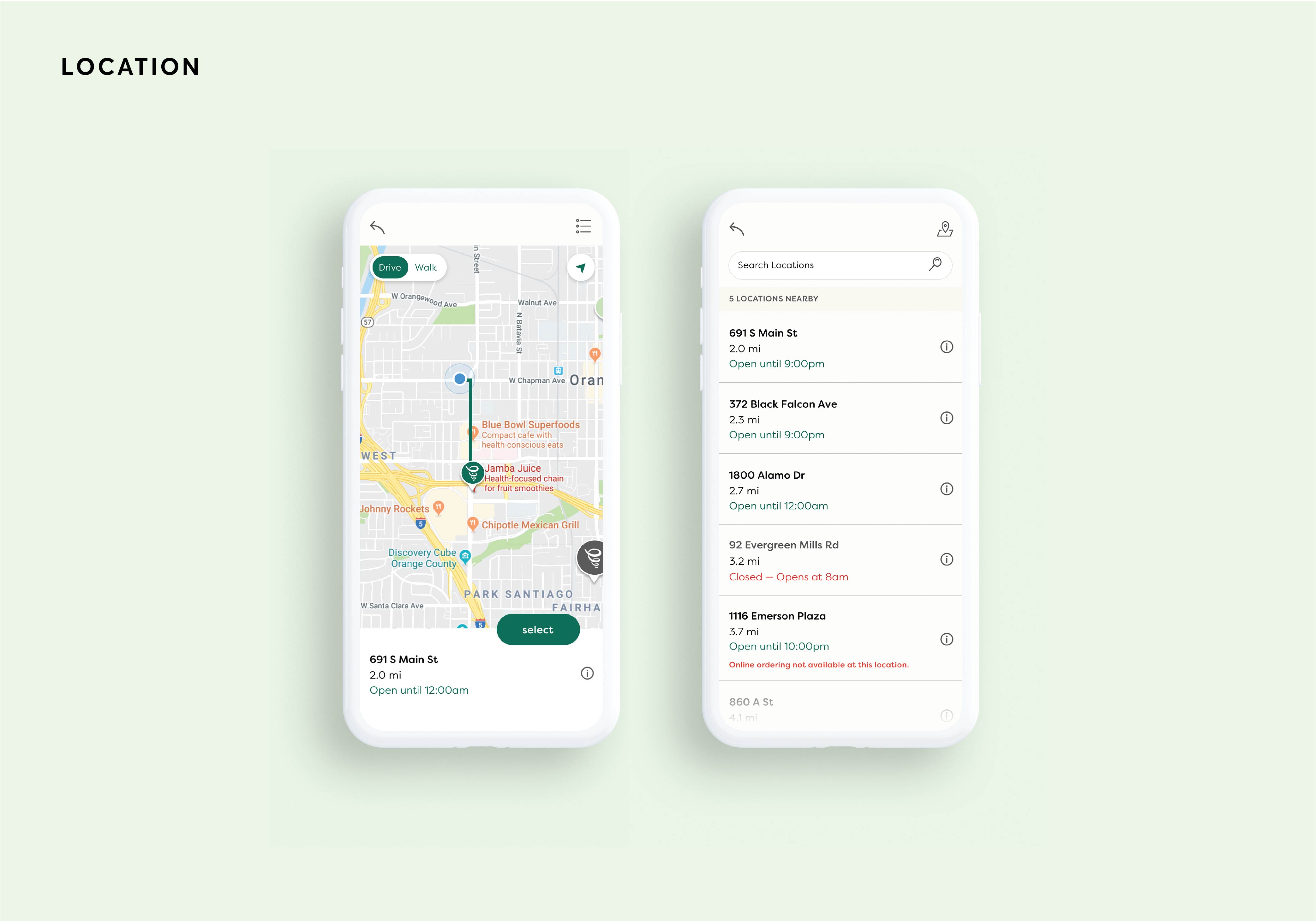
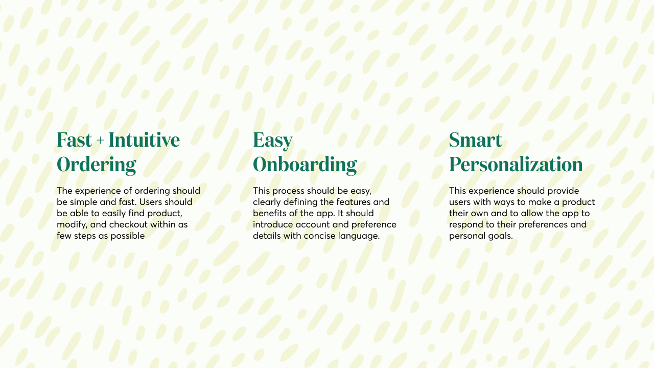
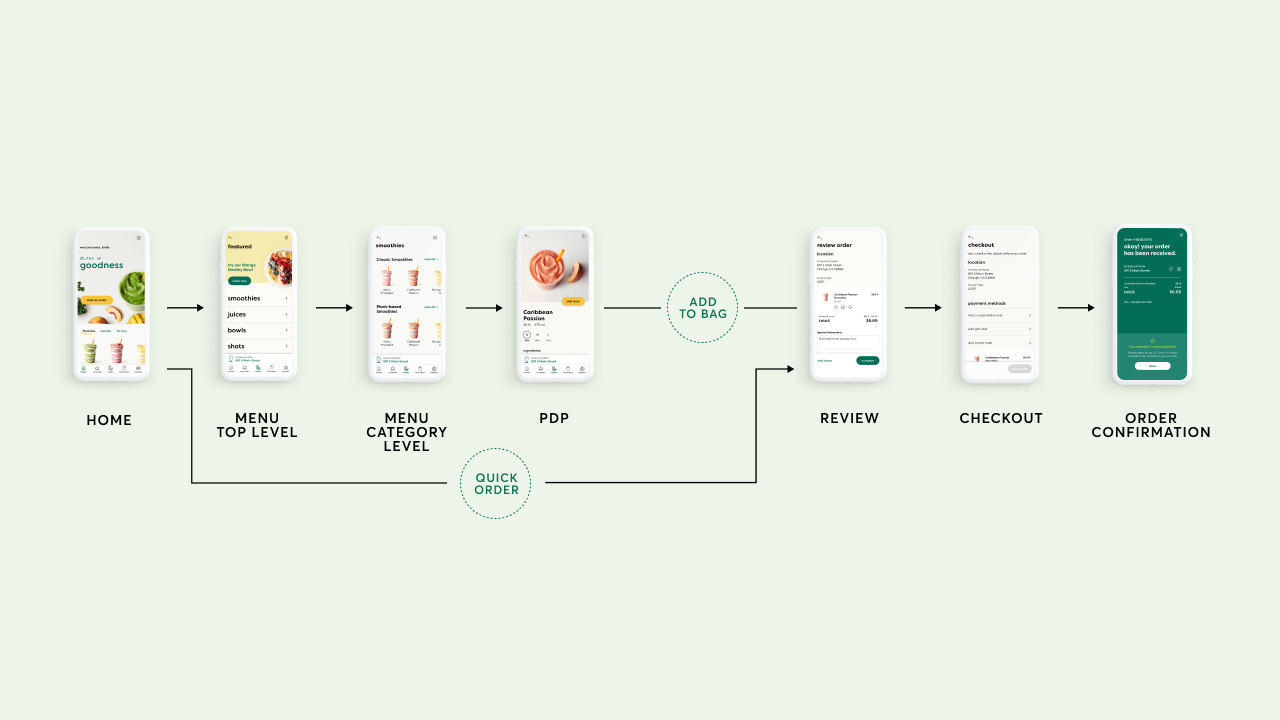
I worked with Jamba to update their mobile app UX/UI to expand on their latest brand refresh. The goal was to create a faster ordering experience that felt personalized and effortless through designing, developing, and user-testing prototypes of the app. A roadmap and design intent was provided to aid with future builds of the application.
I defined the visual language and design intent and ideal user experience. Product research was also a big part of this process and I co-led customer and employee interviews with a prototype. I worked closely with the Jamba Creative Director at the time to ensure that their latest brand development and product photography were connected to the mobile experience and visuals designed.
![Jamba_phoneHand_homeScreen](https://bohlmanndesign.com/wp-content/uploads/2019/11/Jamba_phoneHand_homeScreen.jpg)
![Jamba_phoneHand_homeScreen](https://marisabohlmann.com/wp-content/uploads/2019/11/Jamba_phoneHand_homeScreen.jpg)
![03_Jamba_experience](https://bohlmanndesign.com/wp-content/uploads/2023/05/03_Jamba_experience.jpg)
![03_Jamba_experience](https://marisabohlmann.com/wp-content/uploads/2023/05/03_Jamba_experience.jpg)
![03_Jamba_experience](https://bohlmanndesign.com/wp-content/uploads/2023/05/03_Jamba_experience-1.jpg)
![03_Jamba_experience](https://marisabohlmann.com/wp-content/uploads/2023/05/03_Jamba_experience-1.jpg)
![05_Jamba_mood](https://bohlmanndesign.com/wp-content/uploads/2023/05/05_Jamba_mood.jpg)
![05_Jamba_mood](https://marisabohlmann.com/wp-content/uploads/2023/05/05_Jamba_mood.jpg)
![06_Jamba_logo](https://bohlmanndesign.com/wp-content/uploads/2023/05/06_Jamba_logo.jpg)
![06_Jamba_logo](https://marisabohlmann.com/wp-content/uploads/2023/05/06_Jamba_logo.jpg)
![07_Jamba_ingredients](https://bohlmanndesign.com/wp-content/uploads/2023/05/07_Jamba_ingredients.jpg)
![07_Jamba_ingredients](https://marisabohlmann.com/wp-content/uploads/2023/05/07_Jamba_ingredients.jpg)
![08_Jamba_color](https://bohlmanndesign.com/wp-content/uploads/2023/05/08_Jamba_color.jpg)
![08_Jamba_color](https://marisabohlmann.com/wp-content/uploads/2023/05/08_Jamba_color.jpg)
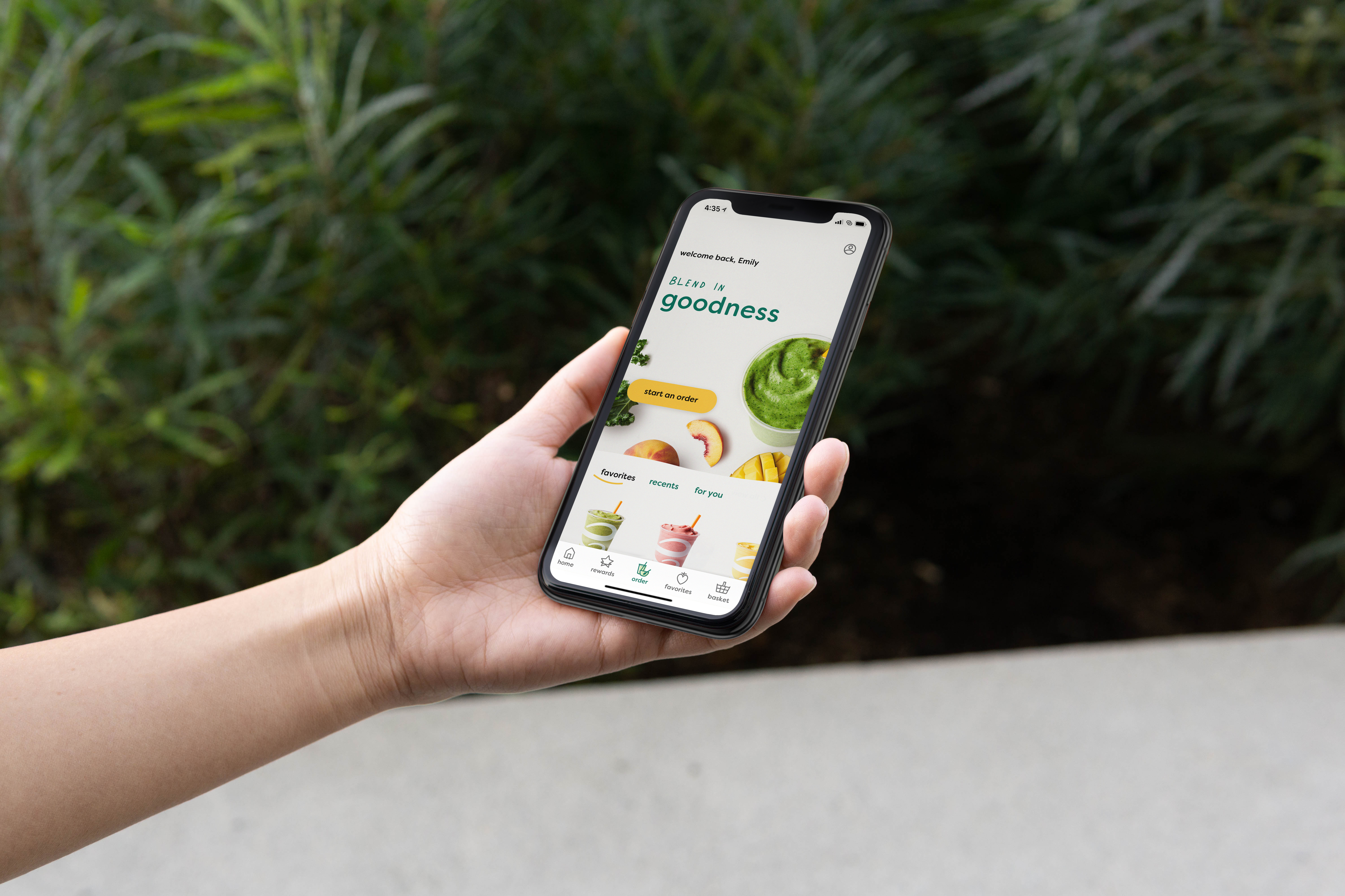
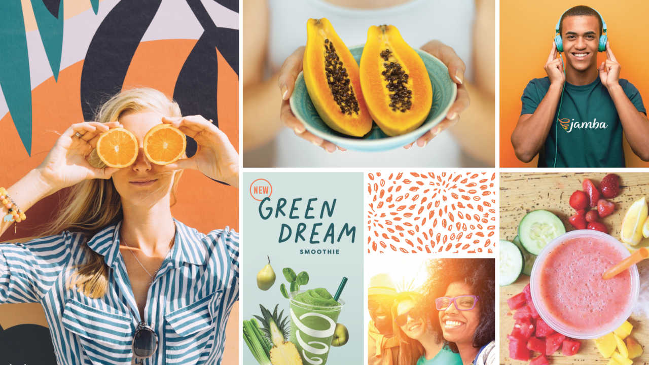
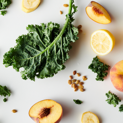
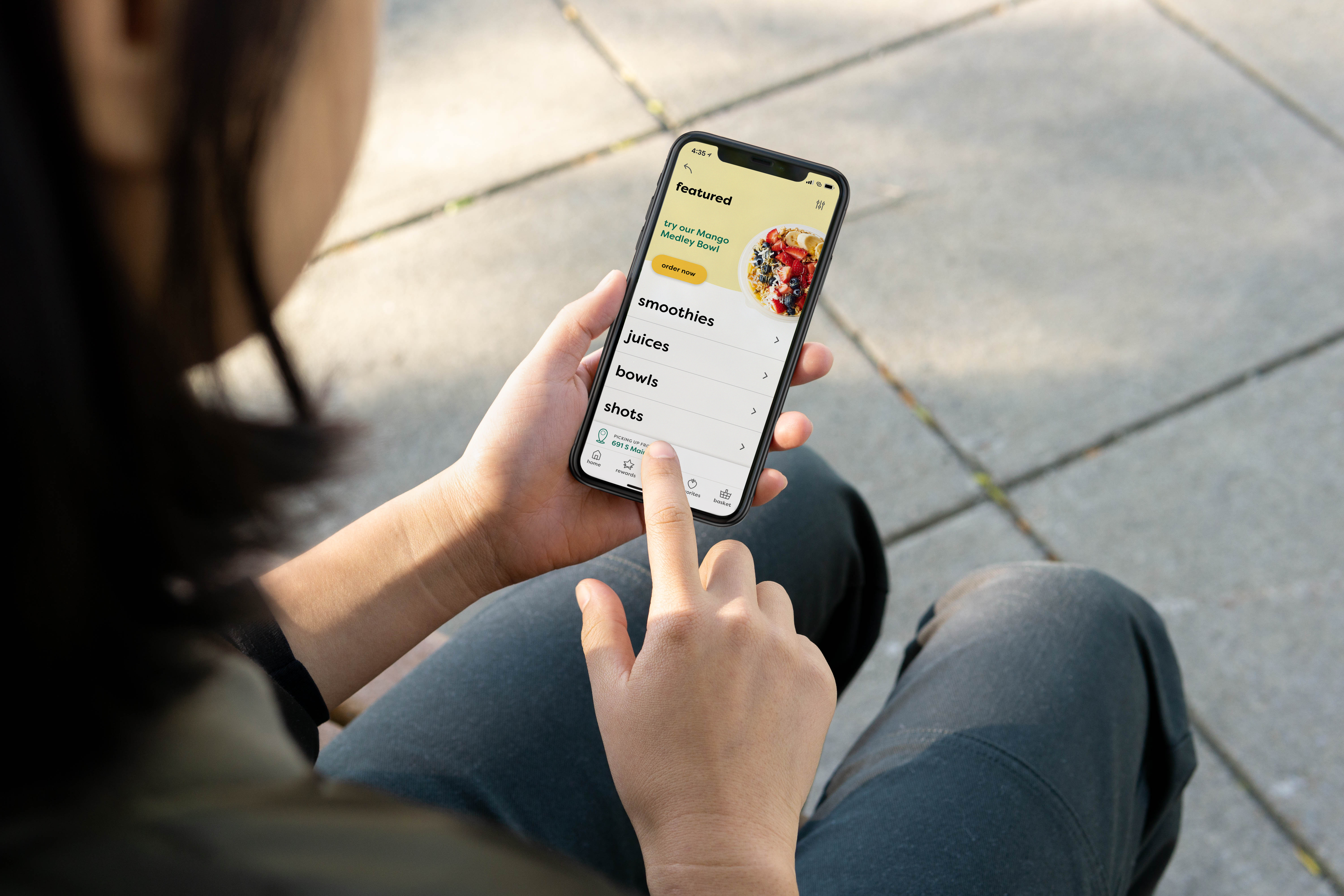
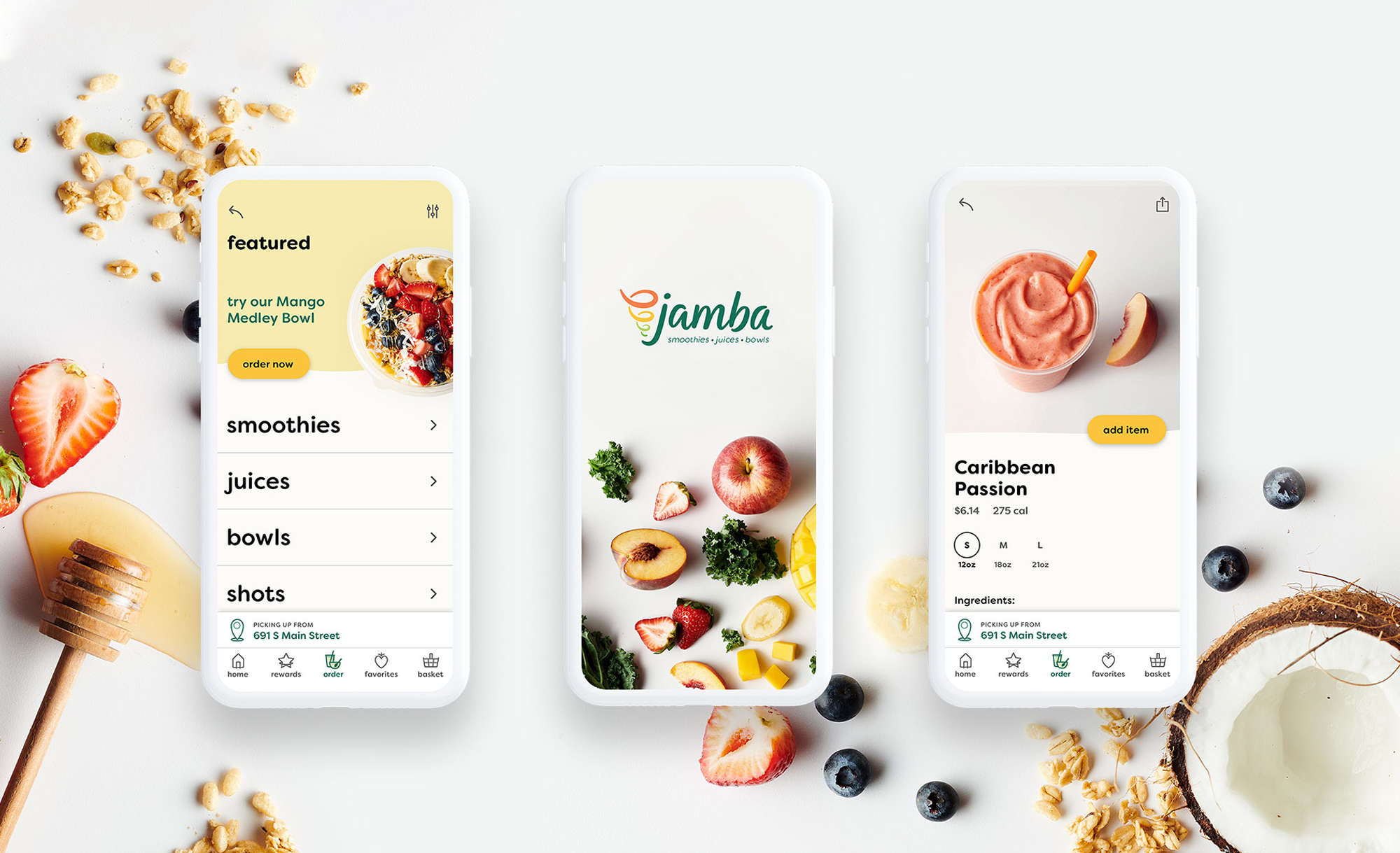
The UX/UI built upon the brands' more recent visual refresh to create a simplified digital-specific visual language. It used color more as an intentional accent for buttons across the app to allow the photography to serve as the 'color hit' alongside a more 'stripped back' UI. Subtle hand-drawn imperfections and iconographic moments were included to tie back to the quirky brand patterns and collage-style photography.
![09_Jamba_flatLay](https://bohlmanndesign.com/wp-content/uploads/2023/05/09_Jamba_flatLay.jpg)
![09_Jamba_flatLay](https://marisabohlmann.com/wp-content/uploads/2023/05/09_Jamba_flatLay.jpg)
![Jamba_MarniPhone_MenuScreen](https://bohlmanndesign.com/wp-content/uploads/2019/11/Jamba_MarniPhone_MenuScreen.jpg)
![Jamba_MarniPhone_MenuScreen](https://marisabohlmann.com/wp-content/uploads/2019/11/Jamba_MarniPhone_MenuScreen.jpg)